Filtering Results with Power BI
Using filters to display Detailed Results in Power BI
This article describes how to create a PowerPivot result set in Excel that is then used by PowerBI in a Pie Chart to display Categories and a Clustered Column Chart to display Product Details in a dynamic format. This article uses the Northwind SQL database as the data source and implements Highlighting and Filtering details in the Clustered Column chart of Products.
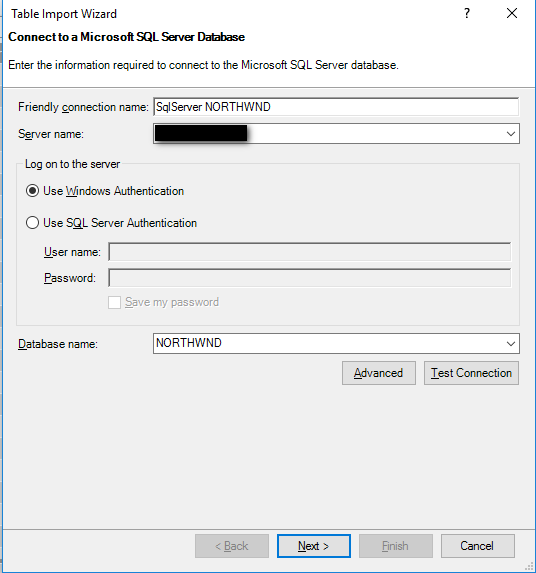
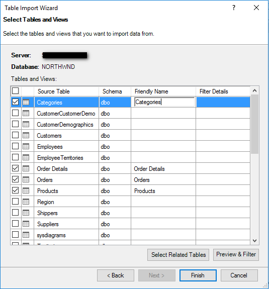
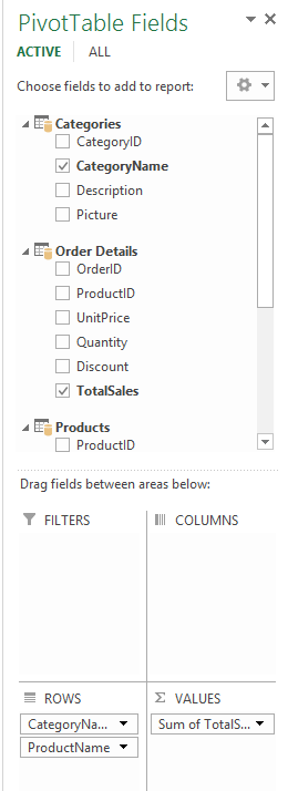
In Excel go to Powerpivot and connect to the SQL Server Northwind database and select tables.
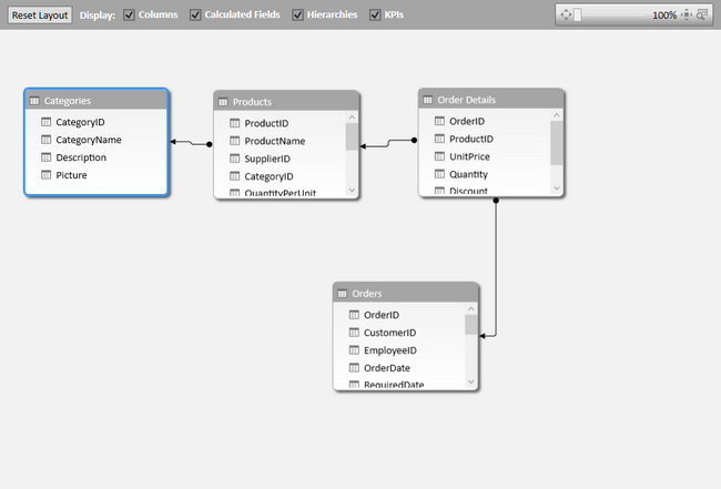
Click on the lower right of the screen to change the view from Grid to Diagram to see Table Relationships.
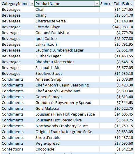
Export the data as a flattened Pivot table in Excel and Save.
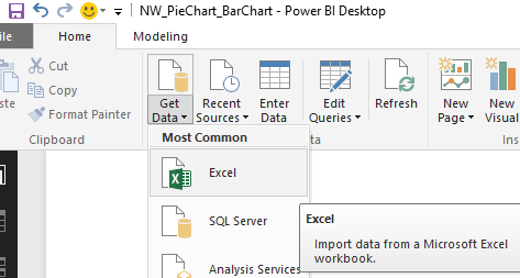
In PowerBI select Excel Source for Data Source.
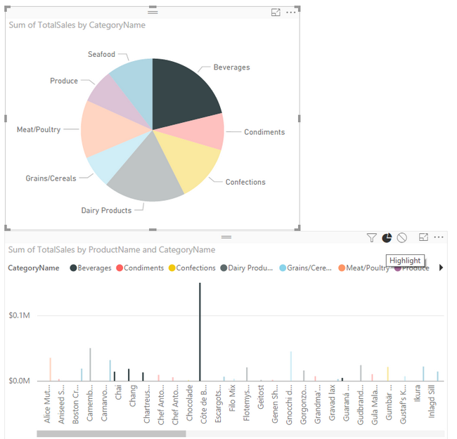
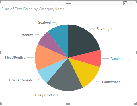
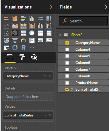
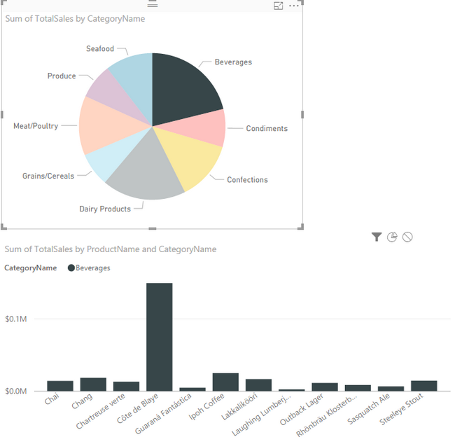
Add a pie chart for Categories and Sum of Total Sales in the Field Selections.
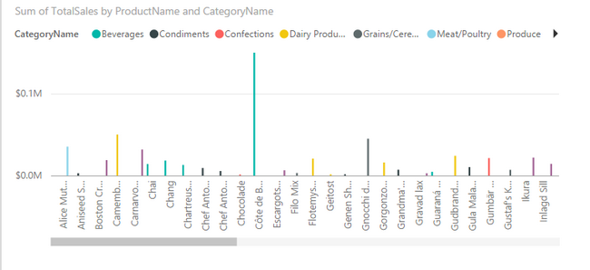
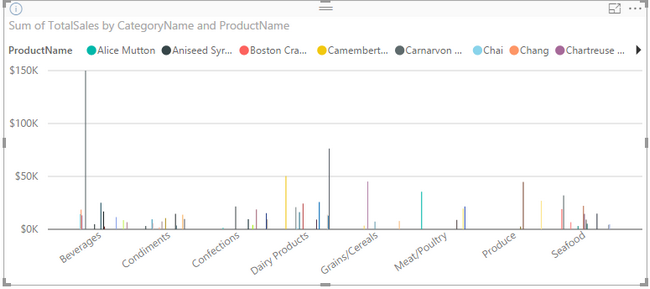
Add a Clustered Column Chart and click fields Products, Sum of Total Sales, followed by Categories to make it appear as below. If Products is selected after Categories, the Products will be listed at the top instead of the Categories.
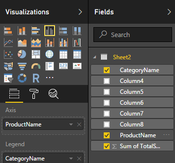
Example of selecting Categories after Products. (Correct)
Example of selecting Products after Categories. (Incorrect)
Filter on the Column Chart to cause only the products with the Pie Chart Category to appear in the same color in the Column Chart.
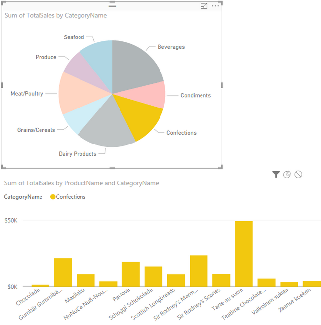
Highlight (the Pie Slice) in the Column Chart to view all Products, but highlight the ones in the selected Category of the Pie Chart.