Python Matplotlib BarChart Plots
BarChart Plots in Jupyter Notebooks
This article describes how to create a Bar Charts from a CSV dataset file using Matplotlib. The Python code is written & executed in a Jupyter Notebook. The CSV dataset file (penguins_size.csv) was downloaded from Kaggle https://www.kaggle.com/datasets/parulpandey/palmer-archipelago-antarctica-penguin-data?resource=download.
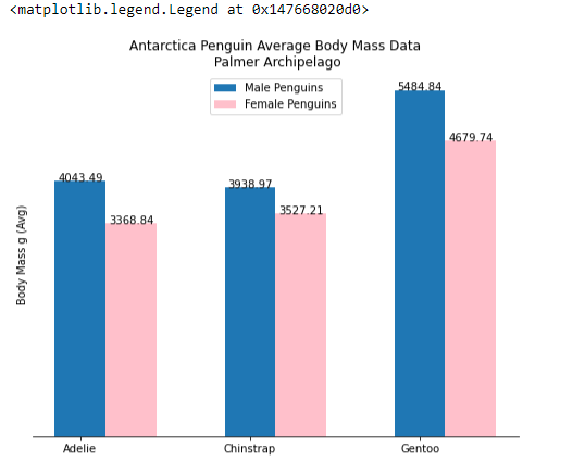
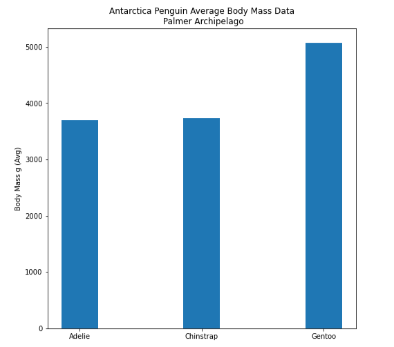
The article describes how to create Bar Charts to display the Antarctica penguins species and compare their average Body Mass.
Load the dataset into a DataFrame
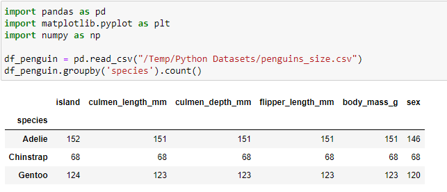
Write code to use pandas to read the CSV data into a DataFrame and then write a statement to view the data. The DataFrame GroupBy statement is used to display a Count for each species of Penguin. df_penguin.head() could have also been used to take a look at the data.
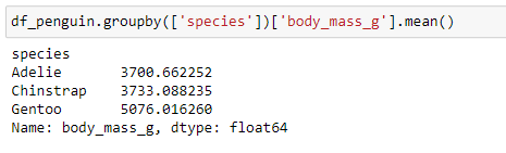
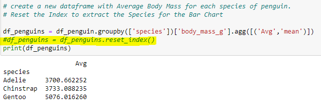
Another dataframe statement to get a look at the data by Grouping the Species and displaying the Average body mass (aka the Mean).
DataFrame & Lists for the BarChart
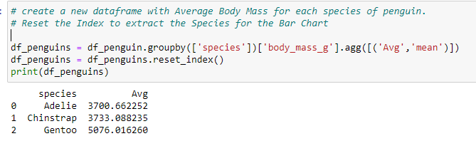
Create a New DataFrame - Create a New Dataframe to capture the Grouped Average body mass by Penguin Species. Reset the Index for the new DataFrame.
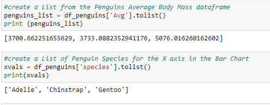
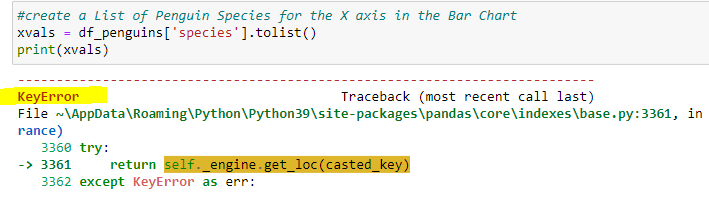
Create Lists for the X & Y axis of the Bar Chart. Each statement will create separate Lists to be used in the matplotlib code and produce the chart.
Note:If the Index is not Reset when creating the DataFrame for df_penguins, the query for the Species as a separate List will not work.
Matplotlib BarChart - Create the code to output the chart to include the Size, Title, Y-Axis, and data for plt.bar.
plt.bar arguments are the X-axis values (penguin species names), Y-axis values (body mass averages).
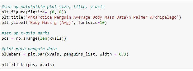
The Bar Chart should appear after running the code. The addition of the values for each bar would be helpful.
Updated Version of Matplotlib BarChart - a barchart with additional information.
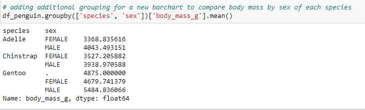
Write code to produce a data to extract the Body Mass average by Species & Sex for comparison.
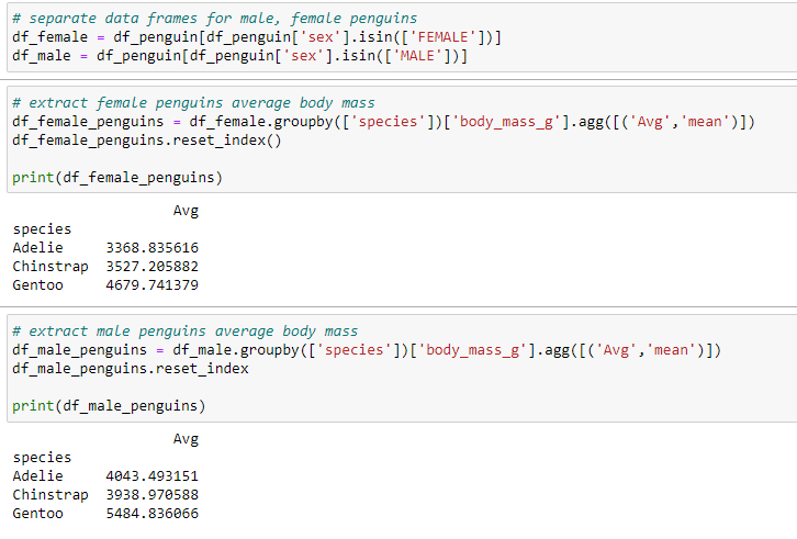
Separate the male and female penguins into 2 data frames (df_female & df_male). Create 2 new data frames for the Average Body Mass of the male and female penguin species (df_female_penguins & df_male_penguins).
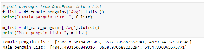
Create 2 Lists from the data frames: df_female_penguins & df_male_penguins.
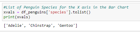
Generate the Penguin Species List for the X axis from the data frame df_penguins. (also shown up above)
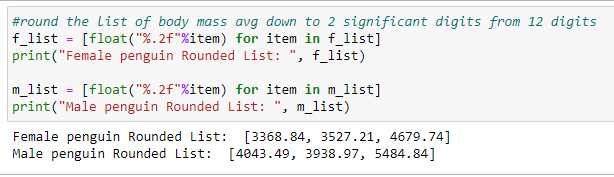
Update the 2 Lists to Round the number of digits after the decimal to 2 (to shorten the 12 digits after the decimal) for both male and females lists (m_list & f_list)
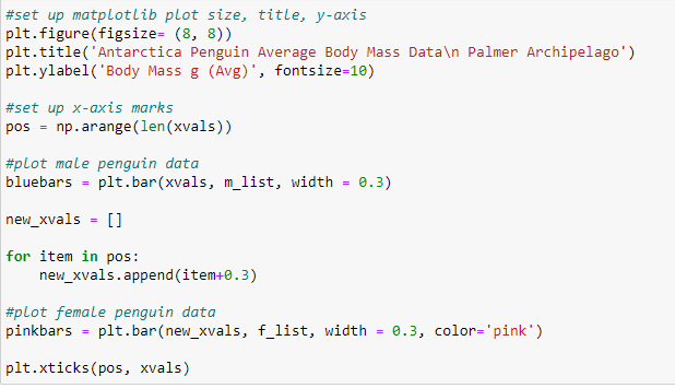
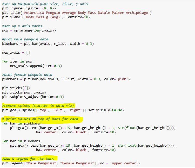
Write code to produce the Bar Chart with 2 sets of bars for each species - one for the Blue bars and one for the Pink bars.
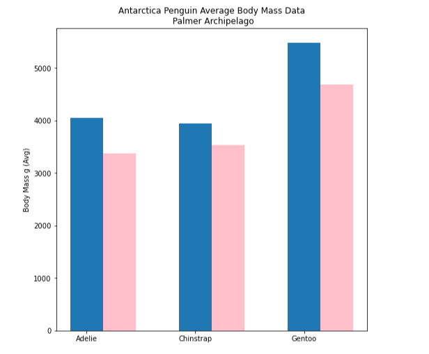
Run the code to produce the first draft of the Bar Chart with body mass values for male and female penguins.
Additional updates to the Bar Chart code will make the Bar Chart Visualization a bit cleaner by adding code to the remove some of the border lines (left, right, top), adding Values on top of each Column, and a Legend for each group.
Final Bar Chart Version