SSRS Charts
Working with SSRS Chart Reports
This article provides information about creating different types of charts in SSRS. Using the Adventure Works database, I construct a simple dataset to show sales by region for sales years 2001 - 2004. A bar chart, pie chart, and line chart are the samples that are used in SQL Server Data Tools (2012). Some of the details on modifying chart reports to get a customized look are also covered here.
Getting Started with SSRS Charts
Charts are a nice visual aid to summarize data from a report. Bar or column charts compare data side by side such as revenue or losses over time or show differences in totals between items. Pie charts are ideal for displaying the percentages of items of total revenue for a period of time, total categories, total of a product line, etc. Line charts are used to display changes over time to sales, losses, and other trends. To get started creating charts in SSRS, I need a DataSource from SQL Server 2012 using the AdventureWorks database.
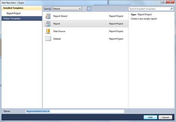
Open up Sql Server Data Tools for SQL Server 2012 and create a new Report.
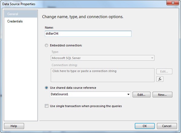
I created a Data Source in the Solution Explorer which was little more than a connection to the SQL Server instance where AdventureWorks currently resides. I create an embedded instance to the report using the Shared Data Source.
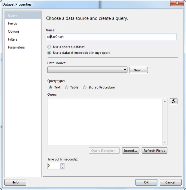
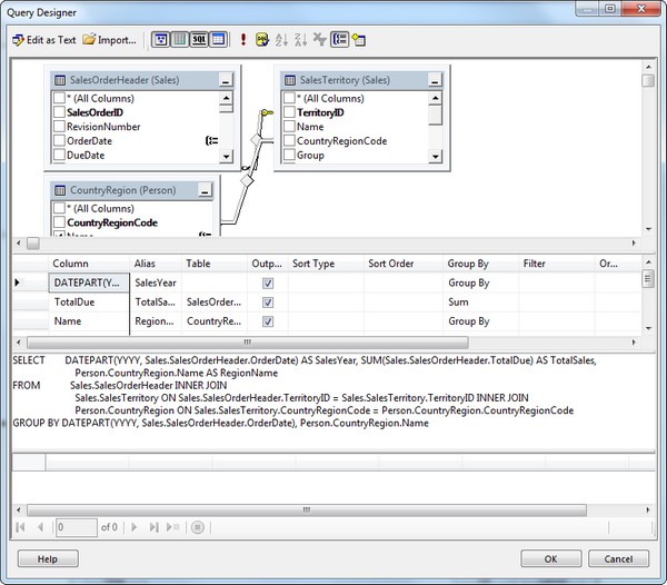
In the Report Data Window, I right click Datasets and create a new one and select my data source and then click on then click on the Query Designer button.
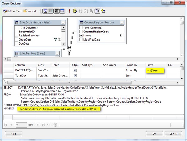
The query uses the tables: SalesOrderHeader, SalesTerritory, and CountryRegion to provide Grouped data by Year (see the part of the query where T-SQL DatePart is used) for the sales by each Region name in AdventureWorks. With the dataset ready, the Chart is ready to be added to the report.
Bar Charts in SSRS
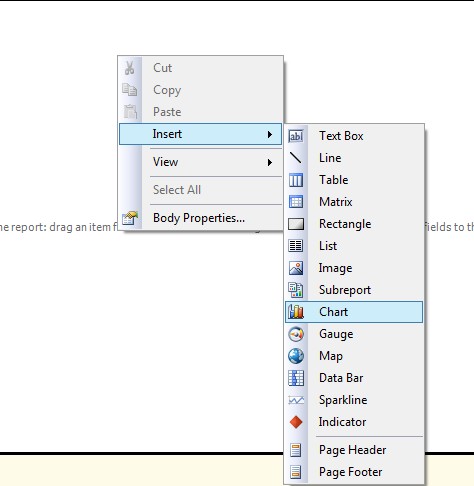
Add a new item and select Report and then right click on blank report and select Insert, Chart.
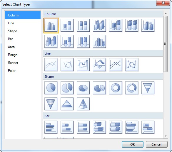
Select Column from the Chart Type and select the first Column box (bars) shown.
From the Dataset, the TotalSales can be added to the Value section of ChartData, and Sales Year as a Category Group, and RegionName as the Series Group to display for each Year.
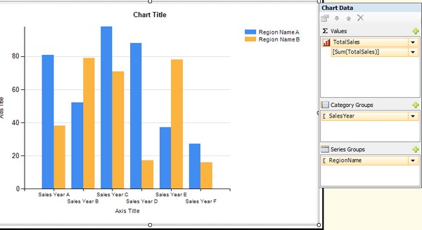
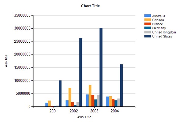
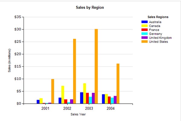
A quick preview shows a preliminary chart that we created, but the numbers need formatting, the chart needs a title, as do both axes. Also, I do not care for the color scheme.
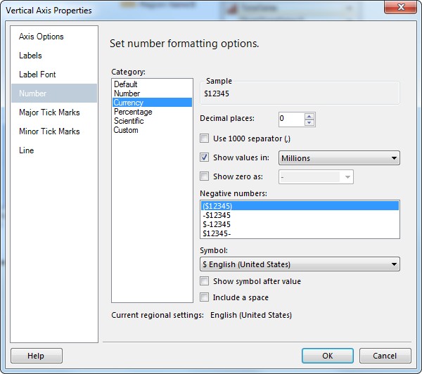
By right clicking on the Vertical Axis, select Vertical Axis Properties to format it. Select Number and then you can choose Number, Currency, etc. and pick the number of decimal places that you want as well as showing values in Thousands, Millions, or Billions of dollars.
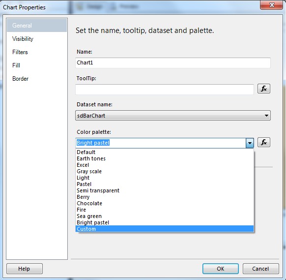
By selecting Chart Properties, you can see what default color palette is used in your chart and you can select one of the other prebuilt color sets or click on Custom to set your own colors.
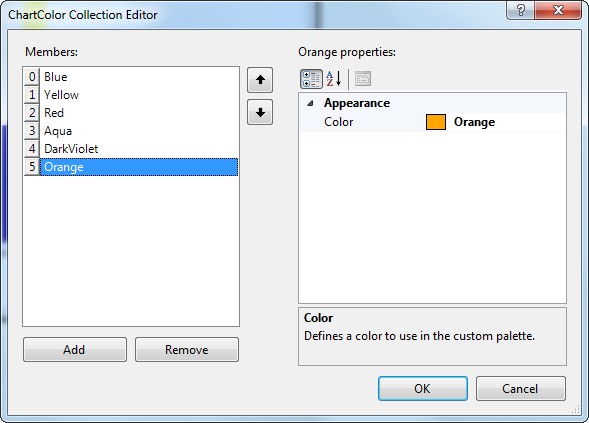
If you select custom colors, click on the Report to see the Properties window (Under Solution Explorer) so you can click on the Custom Palette Colors Property ellipsis to set up your own collection of colors to display.
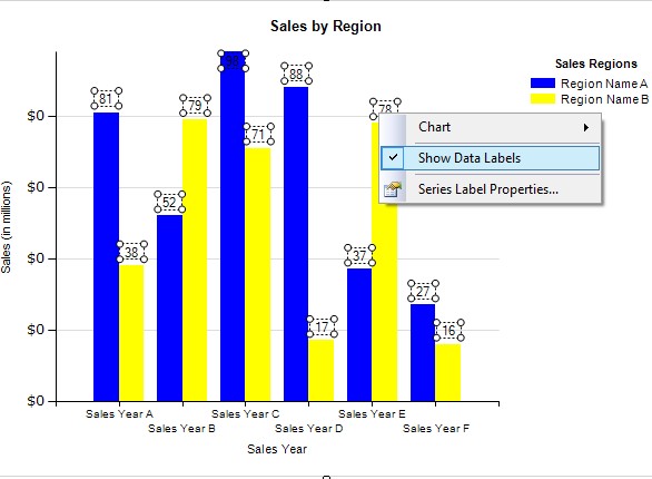
Another option available is Data Labels. On a column chart, it can be pretty messy, but it is possible to do it.
The customized bar chart appears like this.
SSRS Pie Charts & Parameterized Data
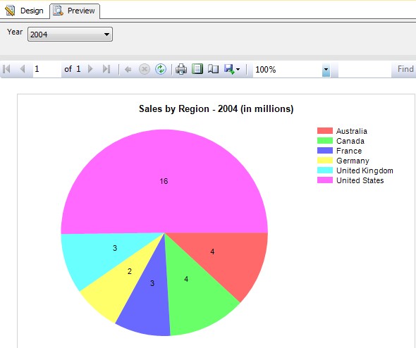
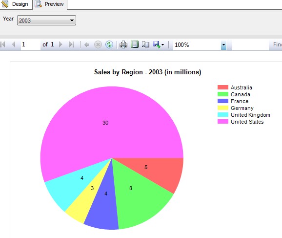
A pie chart displays pieces of data very well to show the percentages of 100% of the picture. The pie chart that I will create here will use a parameter in the Dataset query and then set up Available Values for selection in the report Drop Down list to pick from to display the Sales Data by Region for each Year. I have highlighted the changes that I made to the dataset by adding the filter @Year to the SalesYear field.
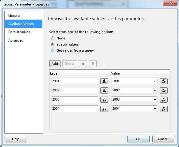
In addition to adding the parameter, right clicking on the Parameter properties and going to Available Values, I then add the label and value for each Year to display in the report drop down.
I also added a customized Title to display the Year selected
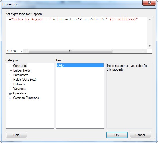
Data Labels were also added to the chart. By going to Preview and clicking on the drop down to Year and then the button to View Report, the pie chart for each year will be displayed.
Line Charts in SSRS
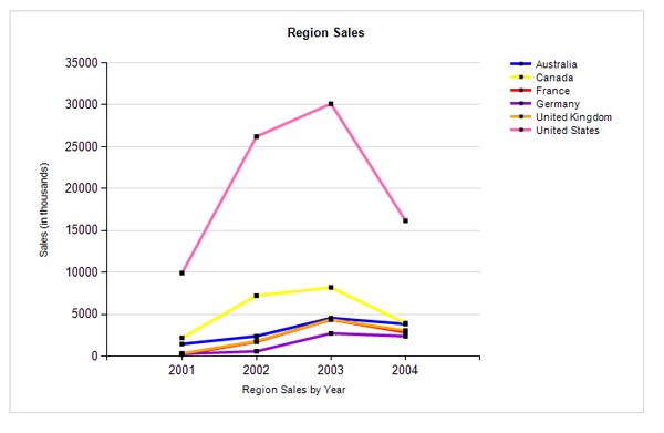
A third chart that I created for the same dataset as the bar-column chart shows the data in a different way over time. I customized the colors and set datapoint squares in the lines as well as adding titles to the axes and top of the report.
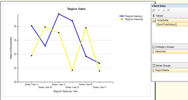
The final product for the Line Chart
