Excel - M&M Spreadsheet and Chart
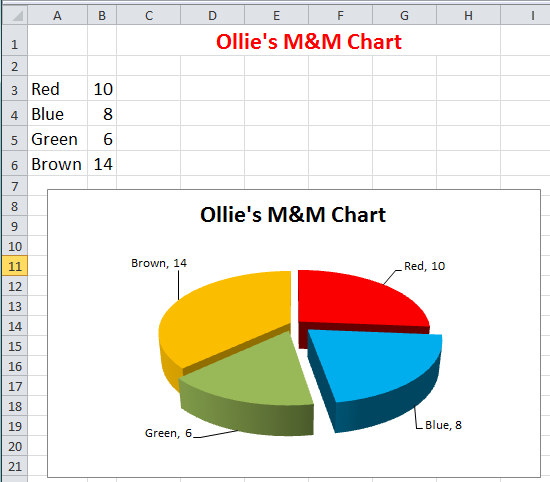
Assignment: Students create a simple M&M candy spreadsheet and chart. Students sort and count the different colors of M&M's in a small bag or handful. Students enter the color names in column A, and enter the quantities in column B. Students use that data to create a chart.
Download: m-and-m-chart-finished-example.xlsx
Excel M&M Spreadsheet and Chart
Download: excel-m-&-m-chart-instructions.pdf
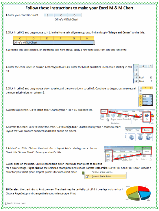
Excel M&M Chart Instructions Printable
This tutorial is applicable to most versions of Windows Excel from Office 2010 and forward.
You could easily do this with the free online version of Excel, though some chart options might be slightly different or missing.
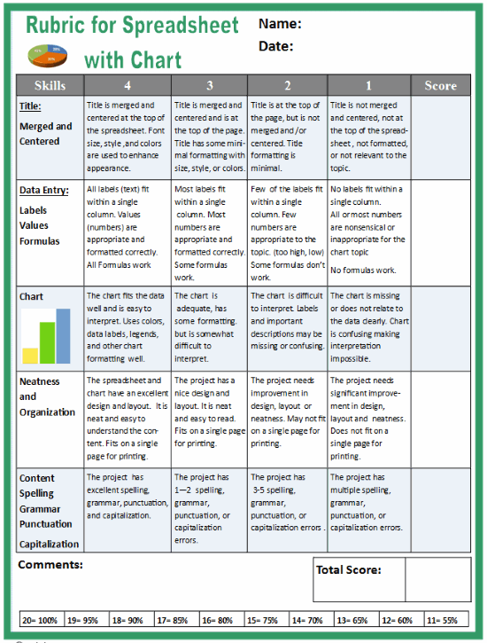
Download: rubric-for-spreadsheet-with-chart.pdf
Excel Spreadsheet Rubric for Grading Assignments
Excel Spreadsheets and Charts
-
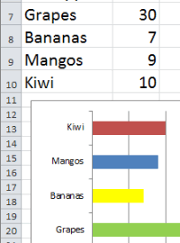
Simple
Bar Chart![Excel Simple Bar Chart]()
-
Thanksgiving
Dinner Shopping![Thanksgiving Dinner Shopping Comparison Spreadsheet]()
-
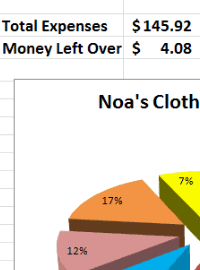
Clothes
Shopping Budget![Excel Clothes Shopping Budget]()
-
Learn Excel
in Minutes![Learn Excel in Minutes]()
-
Excel Back
to School![Excel Back to School]()
-
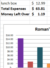
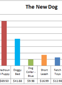
Excel Pet
Adoption![Excel Pet Adoption]()
-
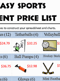
Excel
Sports Budget![Excel Sports Budget]()
-
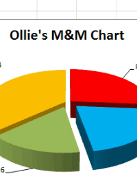
Excel
M & M Chart![Excel M & M Chart]()
-
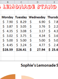
Excel
Lemonade Stand![Excel Lemonade Stand Spreadsheet and Chart]()